A man in a shirt and tie and a woman making silly faces together

Mumbai, India

Brand Story

Where movement begins with connection.

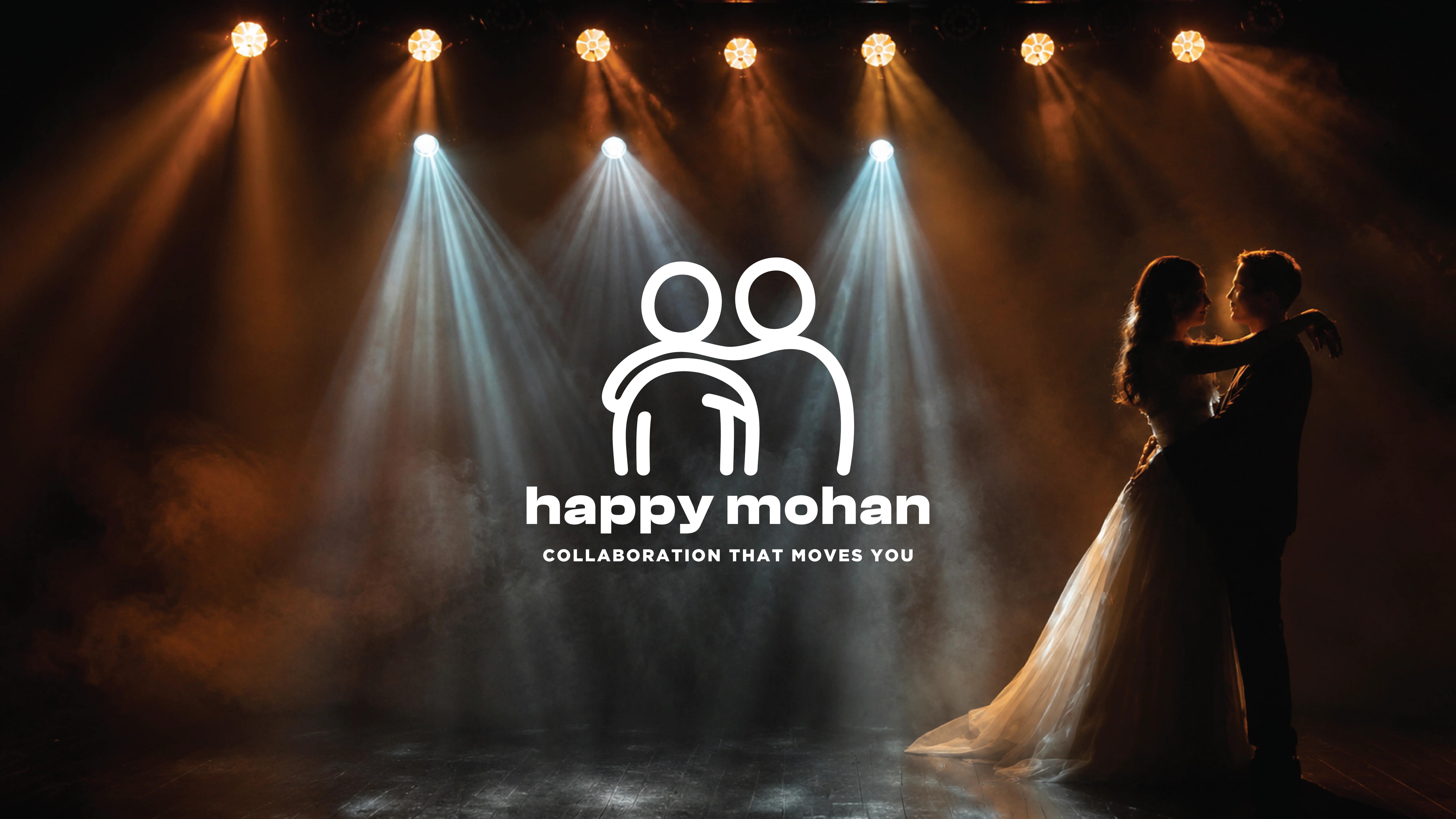
Happy Mohan is more than a choreography studio. It's a community built on trust, encouragement and shared joy, where every performance begins long before the music starts. That spirit became the foundation of the brand.

The image features a black geometric logo resembling an hourglass or abstract star, situated below the phrase "DIAL IT IN" in bold, uppercase letters.

Shaping the Brand

Rather than illustrating dance itself, we chose to express what makes it meaningful. A simple hand resting on another's shoulder became the heart of the identity, a quiet symbol of support, partnership and belonging. Rounded forms, expressive curves and a playful palette bring warmth to a brand designed to feel welcoming, energetic and deeply human.

Designed with Intention

  • A hand on the shoulder represents encouragement and trust.


  • Flowing strokes subtly echo movement while keeping the identity soft and approachable.


  • The circular lock-up reflects a community that grows together.

The best performances are never created alone.

Every project begins with understanding. The rest is shaped together.

Turn Your Vision Into a Strategy That Works

Whether it's a brand, a product or an illustration-led story, we'd love to hear what's on your mind and explore where it could go.

Turn Your Vision Into a Strategy That Works

Every project begins with understanding. The rest is shaped together.

Whether it's a brand, a product or an illustration-led story, we'd love to hear what's on your mind and explore where it could go.

Helping founders build brands that stay with people.

© 2026 GraphicSingh. All rights reserved.

Helping founders build brands that stay with people.

© 2026 GraphicSingh. All rights reserved.