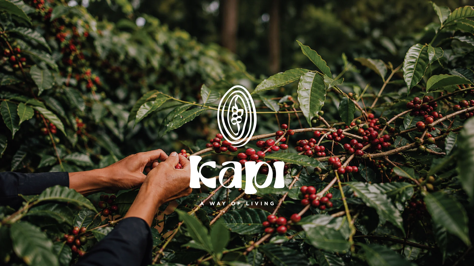
Hands carefully pick ripe, red coffee cherries from lush, green coffee plants, surrounded by dense foliage with the logo "Kapi Way of Living" displayed prominently.

New York, USA

Brand Story

Bringing India's coffee story to the world.

Kapi is a contemporary coffee brand founded in New York with a vision to celebrate the richness of Indian coffee culture. Sourcing exceptional beans from Indian estates, the brand introduces a global audience to a heritage rooted in craftsmanship, origin and generations of coffee-growing traditions.

While India has cultivated coffee for centuries, its story has often remained untold. Kapi was created to change that by transforming every cup into an invitation to discover the people, places and traditions behind every bean. That philosophy shaped a visual identity where branding and packaging work together to celebrate the complete journey of coffee, from plantation to everyday ritual.

The image features a black geometric logo resembling an hourglass or abstract star, situated below the phrase "DIAL IT IN" in bold, uppercase letters.

Shaping the Brand

The identity is inspired by the transformation of a coffee cherry into a coffee bean, celebrating the journey behind every cup. As the forms evolve, continuous loops express coffee as a conscious everyday ritual, a way of living rather than simply a beverage. A subtle thumbprint is woven into the mark, representing every hand that shapes the journey: the farmers who cultivate it, the founders who thoughtfully source it and the people who choose to make it part of their daily lives.

That same philosophy extends across the packaging, where minimal illustrations honour the relationship between the farmer, the coffee cherries and the bean. Bold graphics inspired by the identity create instant recognition, while earthy tones and expressive forms celebrate the story of Indian coffee from its origin to every everyday moment.

Designed with Intention

  • The brand mark reflects the transformation from coffee cherry to bean, celebrating the journey behind every cup.


  • Expressive typography and organic loop mirror the rhythm and movement of everyday coffee rituals.


  • The subtle thumbprint honours every hand that shapes the experience, from the farmers and founders to the people who make Kapi part of their everyday lives.


  • Illustrations honour the farmers, plantations and craftsmanship that shape every harvest.


  • Bold beans and identity across the label celebrate Indian coffee while creating a packaging system that is cohesive, expressive and instantly recognizable.

Every great cup begins with the people and places that make it possible.

Every project begins with understanding. The rest is shaped together.

Turn Your Vision Into a Strategy That Works

Whether it's a brand, a product or an illustration-led story, we'd love to hear what's on your mind and explore where it could go.

Turn Your Vision Into a Strategy That Works

Every project begins with understanding. The rest is shaped together.

Whether it's a brand, a product or an illustration-led story, we'd love to hear what's on your mind and explore where it could go.

Helping founders build brands that stay with people.

© 2026 GraphicSingh. All rights reserved.

Helping founders build brands that stay with people.

© 2026 GraphicSingh. All rights reserved.